Advanced Typography - Task 1/Typographic system & Type & Play
22/04/2024 - 28/05/2024 (Week1 - Week 4)
Teu Yu Tian / 0371923
Advanced Typography | Bachelors of Design (Honour)
in Creative Media | Taylor's University
Task 1 - Typographic system &
Type & Play
 | |
1. LECTURES:
WEEK 1
Lecturer brief us the module and Task. We are given some times to watch
Lecture 1 and explore axial system by our own. Then we are assigned to watch
Lecture1: Typographic Systems, InDesign Formatting tutorial and Modular
System, and also complete task 1 Exercise 1 before week 2 class.
Lecture 1: Typographic Systems (Video)
All design is based on a structural system. (Elam, 2007)
Typographic systems consists of 8 major variation with infinite number of
permutation:
• Axial
• Radial
• Dilatational
• Random
• Grid
• Modular
• Transitional
• Bilateral
- Axial System : All elements are organised to the left or right of a single axis (line).
- Radial System:All elements are extended from a point of focus.
- Dilatational System: All elements expand from a central point in a circular fashion.
- Random Systems: Elements appear to have no specific pattern or relationship.
- Grid System: A system of vertical and horizontal division.
- Transitional System: An informal system of layered banding.
- Modular System: A series of non-objective elements that are constructed in as a standardised unit.
- Bilateral System: All text is arranged symmetrically on a single axis.

|
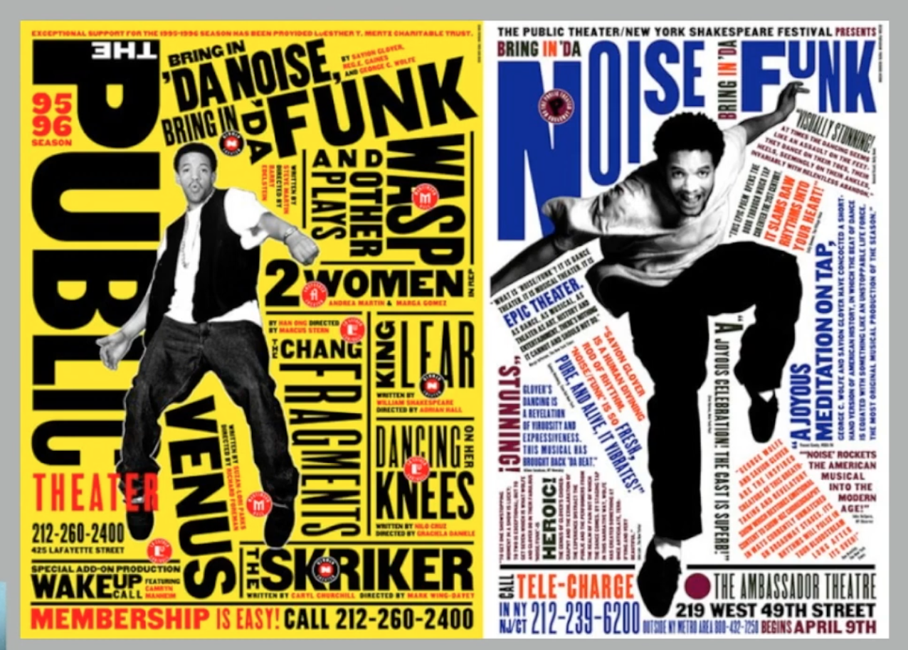
| Figure1.1 Typographic Systems Example 1 |

|
|
Figure1.2 Typographic Systems Example 2 |
WEEK 2
Lecture 2: Typographic Composition (Video)
1. "Typography" has 2 meaning:
- Creation of letter
- Arrangement of large amount of text within the given space
2. Principle of Design Composition:
- Emphasis
- Isolation
- Repetition
- Symmetry
- Asymmetry
- Alignment
- Perspective
- Design Composition usually apply in 2D, not all principle can easily transform into typography, but still can make it in some way.
3. Rule of third
- Space divided to 3 columns and 3 rows, the intersecting line used as guide to place the points.
- Intersecting points become focal point of layout.
4. Typographic system:
- 8 system in lecture 1
- Most used System: Grid System(Raster Systems) Derived from Letter Press Printing.
- Grid System seems to be old or rigid, but also allow infinite number of adaptation. So it is still a popular system.
- Post-modernist era against on clean and neat layout, hence , exploration of chaos, randomness, asymmetry, radial system started to take place.
5. Environmental Grid:
- Exploration of existing structure or numerous structure combined. Structure(painting/interior/structure, etc.)
- Use photo as reference, analysis and simplified into shapes, lines or dots, make it into key feature, information is arranged in the given space based on the key feature.
6. Form and movement:
- Created by Mr.Vinod, this system is created based on exploration on existing Grid Systems.
-
Create different layout based on exploration on existing grid systems, replace those element with either text, image or graphic elements.
- Observed the layout design in slowed-down animations,
- Create variation (As predictable design is boring and less engaging)
- Make surprise on every page. The form can represent image/text or colour.
- Be careful if it is too decorative, too much complexity in movement.

|
|
|
Video Tutorial: InDesign Formatting
- leading: minimum 3pt larger than font size.
- Paragraph after spacing: same with leading.

|
| Figure 1.4 InDesign Tutorial |
WEEK 3
Lecture 3: Context and Creativity
2. Handwriting
- First mechanically produced letterform were designed to directly imitate handwriting.
- It is the basic of mechanical type.
- Shape and lines are influenced by the tools and material used. Such as feather and steel pens.
- Some of it written on clay, papyrus, animals skin, etc.
BCE = before common era
CE = Common Era
3. Cuneiform (3000BCE)
- Earliest writing system, the first link to future alphabetic system.

|
|
|
4. Hieroglyphics (2613-2160 B.C.E)
- Ideograms: Based on image/ things
- Determinatives: sign preceding are meant as phonograms.
- Phonograms: Represent sounds.
- Read from left to right.
5. Early Greek (5th C. B.C.E)
- built on the Egyptian logo-consonantal system, consist of 22 letters.
- Adopted Phoenicians system and added the necessary vowels.
- Horizontal rows with guidelines.
- direction of reading is not fix. (Ox flow)
- drawn free hand and no serif
6. Where the stroke goes thicker, serif appeared, Roman people write in
flat brush, evolve into calligraphy.
7. Roman Uncials (4th C)
- Rounded form.
8. English Half Uncial (8th C)
- slanted and condense form.
9. Carolingian Minuscule
- At that time, writing are standardised, this script emerged.
- Use for legal and literacy work.
- Important development as standard Roman capital but more humanistic writing approach.
10. Black Letter (12-15 C.CE)
- Gothic era(rude of barbaric cultures north of the Italian Alps).
- Vertical supplanted horizontal as dominant line
- Tight spacing, condensed.
- Reduce cost
11. Antica
- Back to Humanist approach
- More rationalised letterform.
12. Movable Type (11C- 14C)
- Wood block printing practiced in East Asia (CJK)
- China attempted to used movable type for printing but was unsuccessful due to the number of characters and the material used (clay).
- In late 14 C., the Koreans established a foundry to cast movable type in bronze, it allow the dismantling and resetting of text.
13. Eastern development of hand writing

|
| Figure 1.6 Eastern Development of Hand Writing |
Evolution of Eastern Letterforms
14. Middle Eastern Alphabets
- The use of sound represented in letters
- script itself has been possibly influenced by the Egyptian Hieroglyphics and Hieratic Scripts.
15. Chinese Script:
- Oracle bone > Seal Script > Clerical Script > Tranditional and simplified script.
16. IVC script - Indus Valley Civilisation (3500 - 2000 BCE)
- Logo symbolic. Some believe these symbol are non-linguistic
- Similar to southern Indian script
17. Brahmi Script (450-350 BCE)
- One of most influential writing systems in Southeast and East Asia.
- Influenced by semitic script.
18. Indian script
- Oldest writing in south east Asia.
- Pallava
19. Malay Archipelago use
- Pallava
- Pra-nagari
- Sanskrit
20. Kawi
- Used for contact with other kingdoms.
- Ancient kingdoms of Malay peninsula may use Indian script and Kawi to write Malay.

|
|
|
21. Incung Script
- Come from south Sumatera
- Original writing system in Kampung Kerinci(now is Bangsar south)
22. Some other related script:
- Rejang Script
- Batak Script
- Bugis Script
- Javanese Script
23. Jawi
- Arabic based alphabets
- Script used for famous work of literature.
24. Young generation designer can help to codify or digitalised those
scripts to preserve them. It is important to keep our heritage.
25. Multi-script a digitalised script that can type vernacular and
Latin script
26. Designers who produced digital vernacular script.
- Mutu Nedumaran
- Huruf
- Ek Type
- Indian Type Foundry
WEEK 4
Lecture 4: Designing Type
1. Design Type
There are many typeface in the world, so why want to design more?
- Type design carry social responsibility, so we have to increase legibility.
- Type design is a form of artistic expression.
2. Adrian Frutiger
- Designer of Univers, Frutiger
Frutiger:
- Purpose: to create a clean font that can be read from both far and close. He test legibility with poor light condition and moving form.
- TM point and Celom use Frutiger.
- It is the first typeface experience digitising.
- Indian realise that they do not have enough typeface for digital. They then bring Adrian to design Devanagari for modern typesetting and printing process. Create typeface based on a script that you don't know is challenging.
3. Matthew Carter
- Royal Designer
- Designer of Verdana, Georgia, Bell centennial.
Verdana:
- Purpose: extreme legible on tiny small size.
- Verdana derived from pixel, so alphabet I, J, L look confusing.
- Ikea previously use Futura.
Bell centennial:
- Telephone directory use rough paper, printing was quick and fast, so it cause blur printing. So he design with ink trap

|
| Figure 1.8 Bell Centennial |
4. Edward Johnston
- Designer of Johnston Sans
- Asked to create bold simplicity typeface rooted in tradition.
- Combine classic roman proportion with humanist warmth.
- Use for poster and signage of London Underground Railway.
- He abandon serif from original font.
- Similar to Gill Sans, Gill is Johnston's student, is actually based on Johnston Sans, monotype.
5. General process of type design:
1. Research
- Understand type history, anatomy, conventions, terminologies and so on.
- Determine purpose, and what it would use for.
- Study existing font
2. Sketching
- Hand drawn (better control, but takes time)
- Digital (quaker consistent, but disobey humanise feeling)
3. Digitalisation
software:
- FontLab
- Glyphs
- Adobe Illustrator
- Counter-form also important for readability.
4. Testing
- Refine and correct, prototype, getting feedback.
- Display type: readability and legibility not that important, because is can be focus more on expressions.
5. Deploy
- Keep on testing
- Rigour
6. Type Construction
- Roman capital: Constructed on grid
- Consideration: Grouping characters in different shape and size(round/ rectangular/diagonal/) .

|
| Figure 1.9 Construction and Considerations |
- Visual correction on extrusion of curve form pass the baseline and cap line, Fitting - distance between letters, white space of letter,
7. Design type
Motivation from
- intrinsic - driven by interest, identify gap that can be solve by designing typeface
- Extrinsic - commissioned or asked to design in certain purpose.
- Designing a typeface is a labour of LOVE.
WEEK 5
Lecture 5: Perception and Organisation
1. Perception
- The way in which something is regarded, understood, or interpreted
- Perception in typography is about navigating reader's visual through contrast, form and organisation of the content.
2. Rudi Ruegg
7 method to create contrast:
1. Light vs Bold
2. Condense vs Extended
3. Organic vs machined
4. Roman vs Italic
5. Small vs Larger
6. Negative vs Positive
7. Serif vs Sans Serif
8. Ornate vs Simple
9. Red vs Blue

|
| Figure 1.10 Type of Contrast |
- Contrast is to create distinction and hierarchy to differentiate content and title.
3. Carl Dair
7 method to create contrast:
1. Size
2. Weight
3. Form
4. Structure
5. Texture
6. Colour
7. Direction
4. Contrast in Size
- Contrast of size grab reader attention
- Usually use bigger headline or title.
- Only use 1-2 pt bigger
- Sometimes just use same size make it bold/black or different weight.
5. Contrast in Weight
- Bold type stands out , can also use bold, rules, spot, square to create heavy area for attraction or emphasis.
6. Contrast in Form
- Difference between capital and small letter or roman and italic letter.
- Condense and expand
7. Contrast in Texture
- Apply size weight form and structure to a block of text on a page
- Texture is the lines of type look as a whole , from close and distance.
- Create layer of texture, it create contrast.
|
| Figure 1.11 Contrast in Texture |
8. Contrast in Direction
- Opposition between vertical and horizontal, and angle in between.
9. Contrast in Colour
- Second colour have less emphatic value than black or white.
- So need to consider well on which element need to be emphasise using colour.
- Too much colour might distract reading
10. Form
- Overall look and feel of the elements that makes up the typographic composition
- Leading eye from point to point. memorable.
- From greek word Typo(form) graphis(writing), typography means to write according to form
- 2 function of typography:
- represent concept
- show through in visual form
11. Type display is a form that gives a sense of unique letterform
characteristic and abstract/artistic presentation.
12. When typeface perceived as a form, it is not readable due to
distortion, enlargement, texture or extruded into a space.
13. Organisation/ Gestalt
- Gestalt: German word : the way a things has been places or put together.
- Gestalt theory emphasising the whole of anything is important than its parts.
- The sum of its part should not grater than the whole.
14. Gestalt grouping:
1. Law of Similarity
2. Law of Proximity
3. Law of Closure
4. Law of Continuation
5. Law of Symmetry
6. Law of Simplicity
- Similarity: Similar element considered as one group. (Colour, orientation size or motion)
- Proximity:Elements that close to each other perceived as a group.
- Closure:Minds see a complete figure even part of the picture is incomplete or hidden by other object.
- Good continuation: The human eye follows the paths, lines, and curves of a design, and prefers to see a continuous flow of visual elements rather than separated objects. (even it forms from broken lines)
Task 1 - Exercise 1: Typographic Systems
Explore and create 8 typographic system using provided content.
- Software: Adobe InDesign
- Size: 200 x 200 mm
- Margin: 10mm
- Colour: Black + 1 colour
- Minor graphical elements (lines, dots, circles...etc)
Week 1 Attempt
I read through the "Typographic Systems" by Kimberly Elam, take it
as reference whenever I do the specific system to get inspirations
and also search for the examples on Pinterest.

|
| Figure 2.1 Inspirations from Pinterest, Week 1 (24/4/2024) |
Figure 2.2.1 are the first 8 systems i done while Figure 2.2.2 shows few more explorations.

|
| Figure 2.2.1 8 typographic system design Attempt 1, Week 1 (26/4/2024) |

|
| Figure 2.2.2 Other Exploration , Week 1 (26/4/2024) |
I found that I am more comfortable with grid or line guiding
layout. The process of designing grid, axial, and modular system are
smooth whereas radial, dilatational and random system took me more
time to modify, but I still feel they are not appealing even i tried
different design. So i decided to redo them.
Week 2 Attempt
Axial: Increased leading and tracking (Font used:
Futura Std)
Radial: Redo the entire things. I kept two centre point from first draft and modify it.
Initially they looks like two separated info, until I make the
two information looks a little bit cross angle and filling up
each other's space with the help of line. (Font used: Futura Std)
Dilatational: Redo the entire things. Every lines were expanded from the centre circle, some
adjustment of text placing are made to give it a twisted
feeling. (Font used: Bembo Std)
Random: Redo the entire things. I mix and match the font, font size and angle of the
characters so it looks more random. (Font used: Serifa Std, Bodoni Std)
Grid: Make the numbering size same with normal
font size. (Font used: Serifa Std)
Modular: Make the numbering size same with
normal font size (Font used: Gill Sans)
Transitional: No changes (Font used:
Serifa Std)
Bilateral: No changes (Font used: Futura Std)

|
| Figure 2.2.3 Revised Version, Week 2 (4/5/2024) |
Final Task 1 - Exercise 1: Typographic Systems

|
|
Figure2.3.1 Final Axial System, Week 2 (4/5/2024) |

|
| Figure 2.3.2 Final Radial System, Week 2 (4/5/2024) |
|
| Figure 2.3.3 Final Dilatational System, Week 2 (4/5/2024) |

|
| Figure 2.3.4 Final Random System, Week 2 (4/5/2024) |

|
|
Figure 2.3.5 Final Grid System, Week 2 (4/5/2024) |

|
| Figure 2.3.6 Final Modular System, Week 2 (4/5/2024) |

|
| Figure 2.3.7 Final Transitional System, Week 1 (26/4/2024) |

|
|
Figure 2.3.8 Final Bilateral System, Week 1 (26/4/2024) |
Fig. 2.3.9 Final Typographic Systems - PDF, Week 2 (4/9/2021)
Fig. 2.3.10 Final Typographic Systems with Grid and Guidelines -
PDF, Week 2 (4/9/2021)
Task 1 - Exercise 2: Type & Play
This task is to create letterforms from an image (either contains of
man-made object, structures, or nature). Extract 4 potential letter
from the image and slowly transform into refined letterforms that
contains the core feature of its origin based on a reference font.
Next is the showcasing of letterform by combining the letterforms
with that selected image.
Week 2 Attempt
I selected a firewood image. I was inspired by the dynamic movement
of fire, so i want to make the final letterform looks like they are
burning.

|
| Figure 2.4.1 Original Image Week 2 (3/5/2024) |
I extracted letter V, L, H, E from the flame, with Futura
Std Heavy as the reference font. First, I adjust the angle and
height of stroke, follow by width, and then adjust the weight of
stroke. I feel the letter it is too rough and not utilised at the
point, so i do hand drawn sketch with detail refinement, make the
gap ratio smaller and equal, make all the hook sharp but keep the
original movement.
The refined letterform (Figure 2.4.2, no.7) looks united but lost
the original characteristic and less dynamic feelings. So I try to
make the gap bigger again and explore with oblique version. It
turns out to be more dynamic and with more obvious
characteristic.

|
| Figure 2.4.2 Letterform Design Compilation - Attempt 1, Week 2 (4/5/2024) |

|
|
Figure 2.4.3 Comparison of Extracted Letterform & Final Letterform, Week 2 (4/5/2024) |

|
| Figure 2.4.4 Final Letterform, Week 2 (4/5/2024) |
The letterform is then put on the edited image and become a poster.
Halftone, Noise, colour overlay are used in the image to stylise it.
The movie captions and logos are PNG file from online sources.

|
| Figure 2.4.5 Font on Image Poster Attempt 1, Week 2 (5/5/2024) |
Week 3 Attempt
Mr.Vinod mentioned that the final letterform looks too similar with
the reference font, losing the original natural sense, the
adjustment until phase 5 (Figure 2.4.2, no.5) is quite enough.
So I used the phase 5 letterform.

|
|
Figure 2.5.1 Phase 5 Letterform, Week 3 (8/5/2024) |

|
| Figure 2.5.2 Letterform Design Compilation - Attempt 2, Week 3 (8/5/2024) |
I modify the poster into 1024px X1024px, 300 dpi, and removed the half tone because it distracted the words.

|
|
Figure 2.5.3 Poster Attempt 2, Week 3 (8/5/2024) |
Week 4 Attempt
I got a feedback to make the title more integration with the image, so I edited the letterform in Photoshop. Outer glow, inner glow are added, I use smudge tools to give the hook more movements (like a flame). Mr. Vinod show me a demo for adding some colour on the letterform.
| |
|
Final Task 1 - Exercise 2: Type & Play


Figure2.7.1 Final - Image & Extraction, Week 3 (9/5/2024)

|
| Figure2.7.2 Final - Letterform Extraction, Week 3 (9/5/2024) |

|
|
Figure2.7.3 Final - Reference Type: Futura Std Heavy, Week 3
(9/5/2024) |

|
| Figure2.7.4 Final - Compilation, Week 3 (9/5/2024) |

|
|
Figure2.7.5 Final - Initial Extraction & Final Refinement,
Week 3 (9/5/2024) |

|
| Figure2.7.6 Final - Final Refined Letterform, Week 3 (9/5/2024) |
| ||
|
3. Feedback:
Week 1: no feedback.
Week 2:
General feedback:
- Designer is to make things clear and readable.
- Avoid diagonal angles (45 degrees).
- Do random system like painting. (artistic approach)
Specific Feedback:
- Modular, axial, and grid system are good to go, need small refinement on typesetting and font size of numbers.
- Radial and dilatational need more works.
Week 3:
General feedback:
- Look at the main element of the image, that is the core (eg: reference the rock, but not the crack between the rock.) Your font need to represent the main element in image.
- You can introduce the element that find in the image.
Specific Feedback:
- Modification until phase 5 is quite enough, after that it looks too similar with the reference font, losing the original natural sense.
Week 4:
General feedback:
- Poster need to have movie productions logo, need to looks like a movie poster.
- Make integration between the words and movie poster, can use Photoshop to manipulate, and use Illustrator to add text and layout.
- Mind the hierarchy of visual , logo and text, dominant must be the title.
Specific Feedback:
- Good design but less integration between title and image.
- Can make it like part of the flame, add a little bit of transparent, something like putting a glass in front and have the fire reflection on it, etc.
- Title can go bigger.
4. Reflection:
Experience
Exercise 1 is quite challenging for me, when I first practicing
those system, i try to come out with some fancy design, but i
realised that to do a good design, you need to have the capability
to do the simplest design system well, then slowly experiment with
more variations and make more changes.
Exercise 2 is an interesting exercise where I have a chance to
create special letterform from an image. I took a long time to
search for the image, struggling with choosing between constructed
element or natural element. At the end I choose natural elements
which is fire.
Observations
Choosing a right font helps a lot to create good design when
designing a type based poster. San serif gives a clean and bold
feelings, it is suitable for clean design, while serif font produce
elegant feelings. Other than that, when creating a font from
reference, it is important to have good control on the details and
stokes in order to keep the original feelings, at the same time
making it more appealing based on the structure of reference
font.
Findings
I thought the Ex 1 would be a simple practice, but I took lot of
time in experimenting, be more familiar with all the systems.
Sometimes when looking on other designer's typography poster work, I
wonder how they can make a type base poster looks so clean and nice
without only helps of lines, or create interesting layout using only
text. Now I know many good layouts are mostly rely on these
systems.
5. Further Reading:
WEEK 1
Typographic Systems-Kimberly Elam (2007)
There are a lot of useful examples in this book for the 8
typographic systems. The examples look simple, but it actually make
a lot of considerations when designing in terms of negative space,
type setting(noticeable tracking and leading space), balance,
imbalance, hierarchy, and so on. Figure 5.1 showing some of the
examples with large negative space and some of it used tracking to
create hierarchy. Instead of making the title heavy or big, loose
space between characters makes the title stands out.

|
| Figure 3.1 Example of design in book |
WEEK 2
Finding Type: A Novel Typographic Exercise - Vinod Nair
This article shows previous student work for Task 2 Exercise: Type
and Play, and also give deeper explanation on the process of
designing letterform. The process start from finding image,
deconstructing an image to identifying letterforms, then extract
letterforms from the image We will also need to identify a reference
typeface and refine letterforms based on the reference typeface.
Student mostly choose high repetitive image, either geometrical or
natural. It turns out to be interesting and strong characteristic
inspired from the original structure.
WEEK 3
A Type Primer by John Kane
A comprehensive typographic theory from character, glyphs to type
history, good type settings and applications. Introducing basic of
typography/letterform/character such as stroke apex, height in a
character, type hierarchy, different kind of layout, margin and
column applications. There are also some interesting typography
poster that introduce the font by emphasise one alphabet as main
visual and display all alphabets and glyphs.

|
| Figure 3.2 A Type Primer |
WEEK 4
Typography Basics - David Creamer (2003)
This book introduced the basic knowledge of computer typography.
There are total of 7 main category of fonts, including serif, san
serif, mono-spaced, display, script, text and
dingbats(symbols). Further explained about the naming of
different font variation under same font families are also
clarified. Font with different stoke weight have their own naming
such as, extra light, bold and heavy. There are some useful tips and
detail explanation for the character and paragraph typesetting
function in Adobe software. Such as the best practice for leading,
kerning, paragraph spacing, and how to set tab correctly.


Figure 3.3 Typographic Basic


评论
发表评论