Advanced Typography - Task 2/Key Artwork & Collateral
13/05/2024 - 10/06/2024 (Week4 - Week 8)
Teu Yu Tian / 0371923
Advanced Typography | Bachelors of Design (Honour) in Creative Media | Taylor's University
Task 2 - Key Artwork & Collateral
 |
1. LECTURES:
Lecture
Task 2(A)Key Artwork :
Week 4 Progression
I started with making mind map about myself such as hobbies, personality, background, and other random stuff, then come out with 3 directions:
1. Ocean (calm but happening under it (representing emotional personality) and inclusive)
2. Natural (no specific shape, I believe everything is possible, so I can be anything)
3. Rain (Yu Tian, is spelling of rain in Chinese ) & firework ( firework is impressive even it only shines one time) i combine them because they could have similar shapes - rain drop and firework sparks.
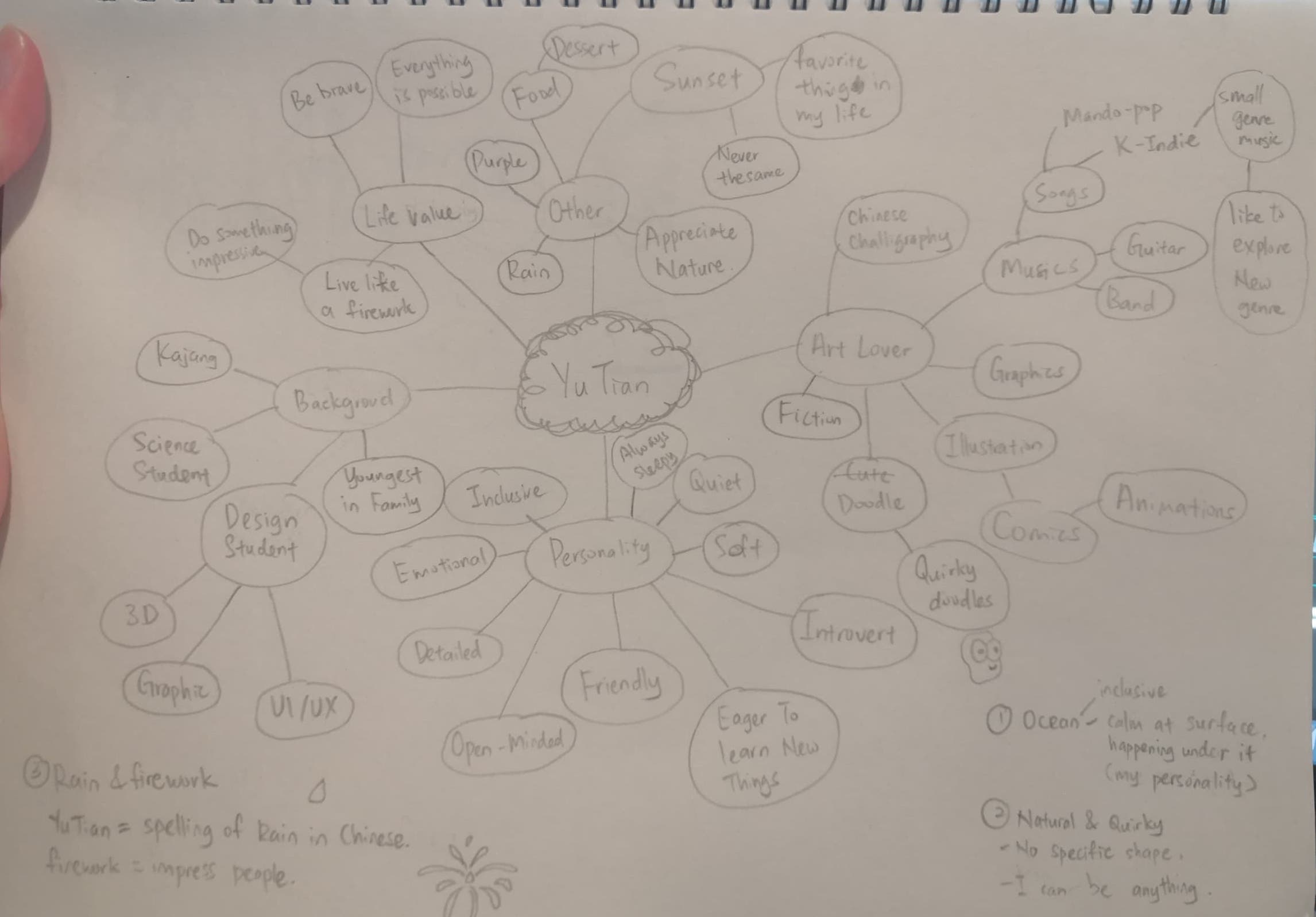 |
| Figure 1.1 - Mind map about myself, Week 4 (16/5/2024) |
I search for inspiration from Pinterest and work in sketches, mostly approach to liquid, natural, wavy and rain drop feeling, there are also some combination exploration of my name's alphabets.
 |
| Figure 1.2 - Inspiration from Pinterest, Week 4(16/5/2024) |
 |
| Figure 1.3 - Sketches, Week 4(18/5/2024) |
 |
| Figure 1.4 - Digitalising, Week 4 (19/5/2024) |
It is a hard to achieve rain feelings (idea 3), so work on natural (idea 2) and rounded shape inspired from liquid. The y.u looks like a face with closed eyes and a nose (or maybe mouth).
Week 5 Progression
 |
| Figure 1.5 - Logo attempts 1 and 2, Week 5 (20/5/2024) |
Exploring alphabets combination, but it does not represent my personality, it looks sharp and weird.
 | |
|
I decided to go with this logo (Figure1.7 left) and modify the proportion of the letters.
 |
| Figure 1.7 - Logo modification, Week 5 (24/5/2024) |
Week 6 Progression
 |
| Figure 1.8 - Logo on print, Week 6 (27/5/2024) |
I choose bluish tone as it is colour of ocean and water.
 |
| Figure 1.9 - Colour Attempt 1, Week 6 (27/5/2024) |
The light blue and turquoise are replace with pale yellow and yellow as the current colour palette is lack of complementary colour.
 |
| Figure 1.10 - Colour Attempt 2, Week 6 (27/5/2024) |
Task 2(B) Key Artwork & Collateral:
Thinking about the way to expand visual identity is really struggling for me. I did severe attempt, such as forming a flower-like pattern by repeating one letter (U, A , N). I decided to use flower pattern made from U as it looks more concise.
 |
| Figure 2.1 - Key Artwork Expansion Attempt 1, Week 6 (2/6/2024) |
 |
| Figure 2.2 - Key Artwork Expansion Attempt 2, Week 7(8/6/2024) |
Week 7 Progression
Then, I try to apply the visual expansion on collaterals. I feel the flower pattern is more suitable for single or small quantity number of design (design on cap, t-shirt and name card) than the repetitive use of large and orderly arrangement of patterns (design on tote bag) as it makes it boring.
 |
| Figure 2.3 - Collateral Attempt 1, Week 7(3/6/2024) |
 |
| Figure 2.4 - IG post attempt 1, Week 7(3/6/2024) |
 | |
| Figure 2.5 - IG post and collaterals attempt 2, Week 7(8/6/2024) |
Animated Key Artwork:
My initial idea for the animation is to play with the dot, as my visual identity and key artwork both have the dot, so it can be a key elements for animation. So i come out with an idea starting with the dots comes into the scene, then a flower expand from the dot and start spinning. The flower then transform into the logo while spinning.
 |
| Figure 2.6 - Dot animation, Week 7 (4/6/2024) |
The spinning flower can form different patterns of flowers by rotating the individual petal ( U shape ), represent infinite possibilities, which is one of my concept for the logo.
 | |
|
 |
| Figure 2.8 - Logo animation effect attempt, Week 7(4/6/2024) |
The initial idea for the transition from flower to logo was to create a liquid-like morphing. I search for online tutorial and try to use the auto-trace tool to create masking for them, and I can animate the mask to make shape transition. I failed to make it as the logo is made of separate letters, but the morphing method is only suitable for single element. So, I changed to a simple zoom transition instead.
 |
| Figure 2.9 Create auto-trace mask for the flower, Week 8 (13/6/2024) |
The final animation looking:
| Figure 2.10 - Animated Key Artwork GIF, Week 8 (14/6/2024) |
Final Submission
Task 2(A) KeyArtwork:
1024px, 300ppi
 |
| Figure 3.1- Black wordmark on white background, Week 8 (14/6/2024) |
 |
| Figure 3.2 - White wordmark on black background, Week 8 (14/6/2024) |
 |
| Figure 3.3 - Colour palette, Week 8 (14/6/2024) |
 |
| Figure 3.4 - Wordmark in actual colours on lightest shade of colour palette, Week 8 (14/6/2024) |
 |
| Figure 3.5 - Word mark in lightest shade of colour palette on darkest shade of colour palette, Week 8 (14/6/2024) |
| Figure 3.6 - Animated Key Artwork GIF, Week 8 (14/6/2024) |
Task 2(B) Key Artwork & Collateral:
Collateral 1, 2, 3(1024px, 300ppi)
 |
| Figure 4.1 - Collateral 1 - T-Shirt Week 8 (14/6/2024) |
 | |
|
|
| Figure 4.3 - Collateral 3 - Name Card, Week 8 (14/6/2024) |
Instagram link
IG screen grab with good resolution
 |
| Figure 4.4 - Instagram screen grab, Week 8 (14/6/2024) |
3. Feedback:
Week 5:
General feedback:
- Refer to existing wordmark that have similar element to your logo.
- Logo should be impactful, looks different, makes people remember.
- Keyword: what you are going to be.
- What we like is not a concept, your concept should be reasonable.
- Think from 2 point of view: 1. Personal branding, 2. business perception/value
- If the logo print on shirt, will you but it?
Specific feedback:
- Need to adjust the proportion, now looks a little bit weird.
- Think about what kind of client you want, what industry you want to be in? Graphic Tee Company? Swimming pool? Cleaning agency? Who will approach you.
Week 6:
General feedback:
- Good colour scheme will have dark tone, mid tone, highlight and neutral colour.
- The overall shape of logo need to be in a stable shape (oval, circle square, etc.)
- Mind the gap in between, think about how it looks when the logo size is reduced
Specific feedback:
- Colour scheme to harmonious, need to have a complementary colour.
Week 7:
General Feedback:
- Collaterals has to be something that connects its purpose and related to each other. (eg: something can wear would be t-shirt, hat and tote bag)
- Brand identity is the expansion from your logo, it can be created by repeating one letter from the logo and make it into a pattern.
4. Reflection:
Experience
I went through the process of designing my personal logo and branding. Brainstorming idea is always a hard phase for me. The challenge for me is to make decision on what I want to express or show to the audience, and how to visually present the idea. In the key artwork execution process, the sketches look fine but does not go the same way in digital version. I took a long time to explore the suitable layout arrangement and adjust the proportion of the logo to achieve the ideal look. I have also experienced animating the key artwork which is fun for me, but I need some improvement on my animation skills. Overall, this is a challenging task for me.
Observation
Good colour combination can make the design impactful. There are many handy tools on the internet that can speed up the design process time. I use Colour Hunt for choosing colour and use Mokey and Unblast for the mockup.
Findings
During the process of making key artwork expansion, I keep trapped in my myself thinking about the logo do not have any good element to use. After looking into industry works, I found that the key is how you use or play with the elements. A designer use counter space shape from a letter as the visual identity, it still turns out great and memorable.
5. Further Reading:
Pentagram: Banco Itau
 |
| Figure 5.1 - Banco Itau brand identity system |
 |
| Figure 5.2 - Banco Itau visual identity application |
Pentagram: Cohere
The main idea of Pentagram's design for Cohere's brand identity is "New Nature." Cohere is a pioneer in creating natural language processing (language AI). They aim to transform them from experimental technology to practical business applications. Pentagram's new brand identity for Cohere is inspired by cell and Voronoi patterns. These patterns represent individual cells that can combine to form new shapes, mirroring how Cohere is composed of various components that together create their own unique story. This visual identity is highly applicable into font and shapes throughout their website.
 |
| Figure 5.3 - Cohere Logo |


评论
发表评论