Advanced Typography -Task 3/Type Exploration & Application
10/06/2024 - 22/07/2024 (Week8 - Week 14)
Teu Yu Tian / 0371923
Advanced Typography | Bachelors of Design (Honour) in Creative Media |
Taylor's University
Task 3 - Type Exploration & Application
 |
1. LECTURES:
Lecture
Task 3:
We are required to create a complete font set for this task, three main
directions are given as such:
Create a font that is intended to solve a larger problem or meant to be
part of a solution in the area of your interest be it graphic design,
animation, new media or entertainment design or any other related area not
necessarily reflecting your specialisation. End result: a complete
generated font (.ttf) with applications.
or
Explore the use of an existing letterform in an area of interest,
understand its existing relationship, identify areas that could be
improved upon, explore possible solutions or combinations that may add
value to the existing letterform / lettering. End result: a complete
generated font (.ttf) with applications.
or
Experiment. For your idea to qualify as an experiment it must be novel and
unique — working with material that might be 3- dimensional, digitally
augmented, edible, unusual, typographic music video or fine art. End
result: defined by student.
Week 8 Progression
I first started with exploring different ideas, and the initial 3 ideas are:
1. Maya culture inspired font (Experimental font)
2. Modernised gothic font (Font to solve problem)
3. Dune movie title typeface (Existing Letterform)
Idea Proposal
I decided to create a Maya-inspired font and began with visual research. Most
of my inspiration came from Mayan culture websites and Pinterest. I noticed
Aztec share similarities with Mayan culture and it is hard to differentiate
them at the beginning. As I gained more knowledge and explored various
websites, I discovered that Maya patterns and motifs often feature diagonal
shapes, even for animals figure design.
Main reference website:

|
|
Figure 1.1 Inspiration from internet and website, , Week 8
(10/6/2024) |

|
| Figure 1.2 Inspiration from Pinterest, Week 8 (10/6/2024) |
Week 9 Progression
I started sketching some alphabets on graph paper, with each letter
constructed on a 25x30 rectangle grid. It was a tough start for me, as I had
to design the patterns within the shapes of the letters. Another challenge was
that some of the typical Maya patterns did not resemble real animals, so I
struggled with how to make audience recognise the figures without losing the
characteristic of Maya patterns.

|
|
Figure 1.3 Sketch, Week 9 (17/6/2024) |
Week 10 Progression
After I became more familiar with the design process, I started designing
the letters in Adobe Illustrator directly, as it was easier to modify and
explore. I first explored the possibilities of animal figures on alphabets,
as they required more precise and thoughtful design compared to loom
patterns and plant motifs. Designing human figures was also challenging
because there is limited space for adding details within the grids.

|
|
Figure 1.4 Alphabet design progress, Week 10 (24/6/2024) |
Week 11 Progression
I continued designing the rest of the alphabets. The process became more
difficult toward the end as I ran out of ideas. I kept searching for more
inspiration online to get more ideas.

|
|
Figure 1.5 Alphabet design progress 2, Week 11 (1/7/2024) |

|
| Figure 1.6 Working Area, Week 11 (1/7/2024) |
The letterform design are based on 4 main elements, which is plant motif, human figure, animal and loom patterns.

|
|
|

|
|
|

|
| Figure 1.9 Font design and reference photo, Week 11 (1/7/2024) |
Each letter has undergone multiple attempts to reach its final design. The
process involved continuous trial and error to achieve a balanced, concise and
harmonious outcome. Here are some different versions or failed samples in red
colours:

|
|
Figure 1.10 different
versions or failed samples in red colours, Week 12 (8/7/2024) |
I added numbers and 5 punctuation design.

|
|
|
Font making in FontForge:
1. Put all letters on individual art board (1000pt x 1000pt), and export
them as SVG. Font Forge is different with Font Lab. The default descendent
is positive number which is 200pt (from baseline to bottom) while
ascendant is 800pt (from baseline to top).
2. Import the letter one by one. (Uncheck scale to fit in import option so
it will not resize your letter.)

|
|
Figure 1.12 Import Options, Week 12 (8/7/2024) |

|
|
Figure 1.13 Font making in Font Forge, Week 12 (8/7/2024) |
3. Readjust the letter position and make sure they align well on the
baseline.
4. Select all letters, turn on auto width and add both side bearing. (40
pt for my font).
5. Pair Kerning.

|
|
Figure 1.14 Pair Kerning, Week 12 (8/7/2024) |
6. Export as ttf.
Week 13 Progression
Font Presentation:
From my observation, I found that Maya textiles are colourful. To reflect
this, I presented the font with four colours. The text is mainly used as a
title and paired with slab serif body text. I also tried to emphasis each
letter on its own, as the letters themselves are already illustrative.

|
| Figure 1.15 Font presentation 1st attempt, , Week 13(15/7/2024) |

|
| Figure 1.16 Font presentation 1st attempt, Week 13(15/7/2024) |

|
|
Figure 1.17 Font presentation 2nd attempt, Week 13 (20/7/2024) |

|
| Figure 1.18 Font presentation 2nd attempt, Week 13 (20/7/2024) |
The selection of the font applications are mainly wearable merchandises.
 |
| Figure 1.19 Font application 1st attempt, Week 13 (20/7/2024) |
Mr.Vinod mentioned that the font application above (Figure 1.19) are not impactful, and some of it have too much white space, the not suitable for square ratio. (for the pin button and toiletry bag). I think i was stuck by what else I can do for font application, and I think I can't improved anymore on my selected item, so I decided to change the application items.
I started looking for inspiration online and also look for more engaging mockup. The process of finding good mockup really takes me a lot of time. I also seek advice from my friend, and she suggested me to do poster with more random and interesting alphabets alignment. Other than that, I look for inspiration on how other people present their decorative font. I found that usually the designer use black and white for the font along with colourful elements.
 | |
|
 | |
|
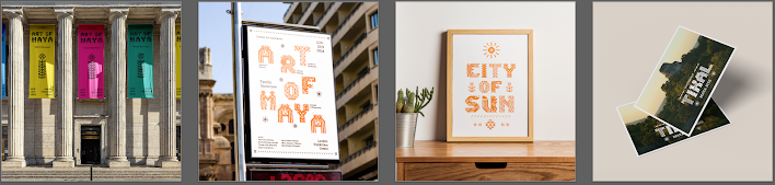
Mr. Vinod says the banner and poster design look good. However, he finds the framed poster and postcard a bit simple or less exciting compared to the other two.(Figure 1.21) He noticed some usable elements in my working file and suggested I use them on the tape and poster. I decided to stick with the textile showcase theme for applications. After another round of finding mock-up and applying the elements, the results are satisfying. The final outcomes are shown below:
 | |
|
Here are some more attempt in my second and third round of application design process, either on exploring possible application or searching for suitable mockup.
 |
| Figure 1.22 Font application random attempt, Week 14 (25/7/2024) |
|
Figure 1.20 Reference list, Week 13 (20/7/2024) |
Final Submission
Task 3 - Type Exploration & Application:
Font Presentation

|
| Figure 2.1 Font Presentation 1, Week 13 (21/7/2024) |
|
|
|
Figure 2.2 Font Presentation 2, Week 13 (21/7/2024) |

|
|
Figure 2.3 Font Presentation 3, Week 13 (21/7/2024) |

|
|
Figure 2.4 Font Presentation 4, Week 13 (21/7/2024) |

|
|
Figure 2.5 Font Presentation 5, Week 13 (21/7/2024) |
Font Link:
Maya Weaving Font (Click for Download)
Font Application

|
|
|

|
|
Figure 2.7 Font Application 2 Poster 1, Week 14 (26/7/2024) |

|
|
Figure 2.8 Font Application 3 Duct Tape and Box, Week 14
(26/7/2024) |

|
|
Figure 2.9 Font Application 4 Poster 2, Week 14 (26/7/2024) |

|
|
Figure 2.10 Font Application 5 Tote Bag, Week 14 (26/7/2024) |
3. Feedback:
Week 8:
General feedback:
- No feedback
- Maya culture inspired letterform: The textile pattern have their x and y axis, so would have to construct table with grid to design the letter. The more grid they have, the more detailed can include. No need to be limited to animals, it can be plants, human figure and loom.
- Modern gothic font: Application to digital interface is too broad, need to have a specific purpose (eg: past student did pixelated gothic font for a game)
- Dune poster title font expansion: Many people did that already.
Week 9:
General feedback:
- No feedback
Specific feedback:
- No feedback
Week 10:
General feedback:
- No feedback
Specific feedback:
- Good job, continue the work.
Week 11:
General feedback:
- No feedback
Specific feedback:
- Lecturer will teach some glyphs construction for my font to make it look more complete.
Week 12:
General feedback:
- Use FontLab or Font Forge to construct to create font file.
Specific feedback:
- Add 3-4 punctuation for my design, make sure it still have some gap between, not fully black.
- I need to set the ascender and descender lines, but can keep them to a minimum.
Week 13:
General feedback:
- No feedback
Specific feedback:
- Don't use small text for the font presentation, as my design is not to use like that. Bigger text is fine.
- Can put my design on t-shirt, box, pin buttons and so on. As long as it is appealing.
Week 14:
Specific feedback:
- Font applications looks okay but not impactful enough. Some of the mockup have too many white space and looks plain, can be further improved.
- The banner and poster looks good.
- Make sure the design stands out in the mockup, and the tone or temperature of all mockup need to be consistent.
- I have a lot of exciting designs, I can use them in the applications.
- Mr.Vinod saw some of my experiment designs, suggested me to apply on duct tape and poster.
4. Reflection:
Experience
This was the most challenging task of the semester. I can’t believe I made
it to the end. I created a unique design for every single letter and
number. The process was torturous, and I nearly gave up. I kept pushing
myself to the limit and searching for inspiration. This was also my first
time using professional type construction tools to create a complete font
set. I learned how to set font height, kerning, and bearing in FontLab and
FontForge. I am glad I went through the process and am overall satisfied
with the outcome.
Observation
Tiny details can significantly affect the design. The counter space
affects the negative space and overall shape of the letter; because of
this, I designed some of the letters based on their counter space. Another
concern is that an odd number of columns made the design asymmetrical, so
I had to modify my design accordingly to achieve symmetry. Overall, every
detail needs to be handled well in order to produce a good design. From my
third attempt at font application, I noticed that my font works well in
black text and is more appealing when displayed on a large scale with a
maximum of four letters.
Findings
Creating experimental fonts was fun and challenging. I learned a lot about
type construction and the Maya culture during the process. The kerning
process took a lot of time and attention to detail. I wish there were a
quicker way to do it, though it is what designers do. Good mockup are
really important.
5. Further Reading:
Pentagram: Natural History Museum
https://www.pentagram.com/work/natural-history-museum/story
Pentagram design a brand new identity system for UK Natural History Museum for its 150th birthday. They want to engage their audience, either existing audience or new audience with the brand identity. The logo constructed by 3 letters: N, H and M in 3 layer radial circle, representing sunburst and ripple effect. Pentagram successfully connect moth natural and technology together and created and engaging, energetic and flexible identity. This identity is suitable for static display as well as animated it by coding. They can move, expand, grow, change form, and interact, producing in an easily identifiable element. Incorporates with different colour palette, it adds vibrancy and excitement to the museum.

|
| Figure 4.1 Natural History Museum |
Reputations: Phil Baines
https://www.eyemagazine.com/feature/article/reputations-phil-baines
This article includes an interview with Phil Baines, an English designer best
known for his experimental design work. While I found it difficult to relate
to various parts of the article due to its personal approach and references to
other designers and styles I was unfamiliar with, there were a few things that
grabbed my interest. I was particularly attracted by the discussion of
letterpress printing and the emphasis on handmade design aspects. He is a
designer who appreciate traditional things but also adapt himself with modern
things as he notice the generations has changed.

|
| Figure 4.2 Degree show poster, St Martin’s School of Art, 1985 by Phil Baines |


评论
发表评论