Teu Yu Tian / 0371923 Application Design 2 | Bachelors of Design (Honour)
in Creative Media | Taylor's University Task 2: Interaction Design
Proposal & Planning
1. LECTURES:
2. INSTRUCTIONS:
REQUIREMENT:
Description
Students are required to develop a comprehensive interaction design
plan for their final web-based mobile application, including detailed
wireframes, user flow diagrams, and prototypes of both micro and macro
animations. The goal is to visually and conceptually prepare the
interaction design and animations that will enhance the user
experience of their application.
Requirements
1. App Project Files & Walkthrough Video
2. Blog post to put together the visual and written explanation.
Imagine you are presenting your ideas and showing what it look like.
3. Video Presentation
Task 2 required us to choose one MVP flow and plan the interaction/animation to enhance the user experience. I decided to focus on the parking reservation feature as my MVP, as it provides the core functionality users need.
I evaluated the animation I can add into my app and classified animations into micro and macro categories, here's the overall animation applied in the app.
Microanimations
Button effects – hover, press animations that confirm interaction.
Tooltips – fade or slide-in hints.
Like buttons – small bounce or pulse after tap.
Switch buttons – ripple, toggle, scale, fill animations on selection.
Range sliders – visual feedback when adjusting price or distance.
Loading indicators – spinners that show progress status.
Content loader – skeleton screens and shimmer effects when the content is loading.
Navigation bar status – icons change from outlined to filled when selected, providing visual state feedback.
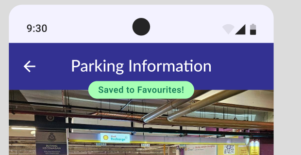
Payment confirmation (simple) – small-scale animations like checkmarks or confetti for positive feedback.
Macroanimations
Pop-up overlays – modal windows that cover part of the screen.
Logo intro animation – branding animation shown on app startup.
Transition settings – page-to-page or section-to-section transitions.
Customised Transition
“No booking” → booking content card – short transitions like fade or slide-in when new content appears.
Map pan + location pin drop – pans and zooms the map to a center postion.
Master plan for the overall animations in the app
Storyboard
Introduced detailed Onload / On-page Offload animations to improve perceived performance and user transitions.
Figma Prototype
Presentation video:
3. FEEDBACK
No feedback
3. REFLECTION
Experience
For Task 2, I focused on designing both micro and macro interactions for the app. This required detailed planning to create interactions that are subtle but still engaging. Before this task, I didn’t fully realize how important these small details are in making the user experience feel smooth and natural.
Observation
As I worked on the interactions, I noticed that minor animations or feedback can make a difference in how enjoyable and seamless the app feels. Micro interactions like button responses and transitions help guide the user without distracting them, while macro interactions shape the overall flow. This made me appreciate how careful design in these areas can enhance the whole experience.
Findings
This task taught me the real value of micro and macro interactions in app design. I now understand that paying attention to these details improves usability and makes the app feel polished. Moving forward, I will be more mindful of these interactions in my designs and plan them carefully from the start.


评论
发表评论